


 Bishop Hill
 Northern hemisphere temperatures and a finite number of 'monkeys'
Climate: Surface This is a guest post by Rob Wilson. Please note, this post forms part of a project for Rob's students and comments will be read and discussed by them. I will therefore be enforcing a fairly strict moderation policy.
As a dendroclimatologist, I am well used to noisy data. Addressing whether the mean “signal” in a sample is a robust reflection of the theoretical population is a key step in any dendrochronological (and statistical) analysis. With this in mind, I find it strange that there can be even any debate as to the “quality” of large scale temperature data-sets (HADLEY/CRU, NASA GISS and NOAA/NGDC) where, compared to trees, the issues related to “noise” (e.g. changes in instruments, movement of monitoring stations, non-ideal location of monitoring stations etc) seem much more trivial, in my mind, than the myriad of different tree and site specific factors that can influence tree-growth.
This is not a blog post about trees and climate however, but rather instrumental data and the robustness of large-scale trends.
A good general review on the issues of instrumental data biases is:
Peterson,T.C. et al, (1998). 'Homogeneity adjustments of in situ atmospheric climate data: a review.' International Journal of Climatology, 18 1493-1517
http://www.st-andrews.ac.uk/~rjsw/PalaeoPDFs/Peterson-etal-1998.pdf
Over the last 6 months, there has been much discussion and debate regarding the output and results of the Berkeley Earth Surface Temperature (BEST) team.
Using a similar but expanded data-set to HADLEY/CRU, NASA GISS and NOAA/NGDC, and different compilation methods, the independent BEST results are in general agreement with those of the other three groups. As far as I am aware, much of the BEST results and conclusions are still going through peer review, but I think their basic overall agreement with previous large scale analyses was not a surprising result to most meteorologists, climatologists and palaeoclimatologists.
This is not a post about validating the analyses of HADLEY/CRU, NASA GISS, NOAA/NGDC and BEST, but rather how to communicate some of the main issues to students as well as the general public. One could quite easily get lost in the blogosphere with respect to potential biases from the urban heat island, or from the non-ideal location of individual stations and how station locations may change over time, but when there is so much data, at least for much of the last 100 years (Figure 1), do such biases really pose a problem?
Firstly, one could encourage students/individuals to read some of the relevant recent papers:
Morice, C. P., J. J. Kennedy, N. A. Rayner, and P. D. Jones (2012), Quantifying uncertainties in global and regional temperature change using an ensemble of observational estimates: The HadCRUT4 dataset, J. Geophys. Res., doi:10.1029/2011JD017187, in press. http://www.metoffice.gov.uk/hadobs/hadcrut4/HadCRUT4_accepted.pdf
Jones, P. D., D. H. Lister, T. J. Osborn, C. Harpham, M. Salmon, and C. P. Morice (2012), Hemispheric and large-scale land surface air temperature variations: An extensive revision and an update to 2010, J. Geophys. Res., 117, D05127, doi:10.1029/2011JD017139. http://www.metoffice.gov.uk/hadobs/crutem4/CRUTEM4_accepted.pdf
P. Brohan, J.J. Kennedy, I. Harris, S.F.B. Tett and P.D. Jones, Uncertainty estimates in regional and global observed temperature changes: a new dataset from 1850. (2006) J. Geophys. Res, 111, D12106, doi:10.1029/2005JD006548. http://www.st-andrews.ac.uk/~rjsw/papers/Brohan-etal-2006.pdf
Hansen, J., R. Ruedy, Mki. Sato, and K. Lo, 2010: Global surface temperature change. Rev. Geophys., 48, RG4004, doi:10.1029/2010RG000345. http://pubs.giss.nasa.gov/docs/2010/2010_Hansen_etal.pdf
However, these are rather long and laborious papers and are aimed at the scientific community and may be too detailed for the average bod on the street – although I hope my students have attempted to go through them. What I wanted to do is try and communicate, more simply, the robustness of the observed warming signal noted in all four of the large data-set compilations.
In my 3rd/4th year module (Reconstructing Global Climate since the Romans), I set my students a simple challenge. They, as a group of around 20 students, would individually derive their own large-scale mean composite series of Northern Hemisphere (NH) annual land temperatures from a small number of randomly chosen station records. How well do their individual records compare with published NH temperature series?
For background, these are physical geography students and are not the most numerate individuals in the world. However, they can use Excel, understand the concept of a time series and know how to average data. So – this situation is not quite an 'infinite number of mindless monkeys and typewriters', but rather a finite number of hard-working 'monkeys' with just a couple of hours to play.
The challenge was purposely simple.
Each student would:
- Download (using the Dutch Met Office Explore (KNMI – http://climexp.knmi.nl)) FIVE random land station records, each covering at least ~100 years, from somewhere in the extra-tropical Northern Hemisphere – there are many stations (Figure 1).
;) Figure 1: Distribution of extra-tropical land temperature records that go back prior to 1910.
Figure 1: Distribution of extra-tropical land temperature records that go back prior to 1910.
- To ensure reasonable coverage around the planet, the students were to download 2 records from North America and 3 from across Eurasia.
- The station data were to be extracted from the GHCN (ALL) data-set which includes BOTH homogenised (corrected) and non-homogenised (uncorrected) data-sets. Using this version of the GHCN data-set would introduce more noise into the exercise as individual records could potentially be influenced by all sorts of homogeneity issues (see Peterson reference above).
- Once the individual station records were downloaded, the students had to import the ascii text column files into Excel and simply calculate an annual mean series for each station record. Missing values, denoted by -999.9, had to be first removed, and the students could only allow the calculation of an annual mean if there were measurements from at least 7 months for any year.
- The students then had to transform the station mean annual series to temperature anomalies relative to a 30 year common period – ideally 1961-1990 – but in some cases due to different end dates of the series, a few students used slightly different period (e.g. 1951-1980).
- Finally, the students averaged their 5 anomaly series together to derive their own personal NH mean annual temperature anomaly series with which they could make comparison to the more robustly derived and better replicated large scale NH temperature series (e.g. CRUT4).
There are some caveats to keep in mind.
- It is possible that the 5 stations chosen by each student were not entirely independent although a quick look through their data files did not flag up any obvious doubling up of the same station data.
- As the number of records changes through time, the variance in the final mean series would increase as the number of input records decreases. No attempt at variance stabilisation was made.
- It is almost certain that the 5 stations each student chose were also included in the HADLEY/CRU, NASA GISS, NOAA/NGDC and BEST data-sets so any comparison to any of these published series is not entirely independent.
Results
Figure 2 presents all 20 student-generated NH mean annual series. As would be expected from NH time series derived from just 5 records, there are some differences and the degree of noise increases back in time as the number of records decrease in each student iteration. However, just from eye-balling, there is a clear common signal between the records at least for the last ~100 years or so, and warming in recent decades is noted in most of the records.
;) Figure 2: Time-series of individual student 5 station NH mean series.
Figure 2: Time-series of individual student 5 station NH mean series.
The correlations of these individual records with NH CRUT4 (over the common period of overlap from 1850-2010) ranges from 0.39 to 0.77 (Figure 3 - mean 0.61).
 Figure 3: Histogram of correlations between each student 5 record mean NH series with CRUT4 annual extra-tropical temperatures
As these correlations may be influenced (inflated) by the positive trends in the data in the recent period, I also transformed the time-series to 1st differences to assess the coherence between the individual records and NH CRUT4 at interannual timescales. As expected, the correlations values weaken – the range being 0.20 to 0.70 (Figure 4 - mean 0.46).
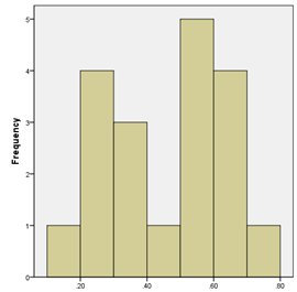 Figure 4: Histogram of correlations (after 1st difference transform) between each student 5 record mean NH series with CRUT4 annual extra-tropical temperatures
So – there is some degree of coherence between the individual student records but due to the low number of input series in each student NH mean series, there is, unsurprisingly, still quite a range in individual record agreement with NH CRUT4. However, by pooling the data from the 20 students together can we improve on their individual results?
Figure 5 shows the simple average time-series (blue line) of the 20 student records compared with mean annual NH CRUT4 temperatures (red line). The correlation between the two series (1850-2010) is 0.89 (0.77; 1st differenced). The salient features in NH CRUT4 are picked up very well in the student-derived NH mean series. No adjustment to the variance has been made.
;) Figure 5: Comparison of CRUT4 annual extra-tropical temperatures (red) with a simple average of all 20 student 5 record means series (blue).
Figure 5: Comparison of CRUT4 annual extra-tropical temperatures (red) with a simple average of all 20 student 5 record means series (blue).
Concluding thoughts
This experiment was purposely set up to be as simple in methodological approach as possible. Having said that, I have to admit that the final comparison is much better than I would have expected. This surely hints at the 'strength' and overall spatial homogeneity of the warming signal seen over the Northern Hemisphere and it clearly can be robustly captured even when using only a very small subset of the available data. Such a simple approach and the use of only a relatively small number of records (~100) would be sensitive to individual station biases if they were systematically coherent over large area. From this analysis, there appears to be no obvious biases in the final mean, which suggests that such biases are mostly station specific and have been minimised through the simple averaging process.
This simple approach does not specifically test whether there is a significant urban heat island effect although there is no obvious deviation between the noisier students 'series and CRUT4 which, might be expected if the UHI was a significant problem in some 'uncorrected' station records. Perhaps next year, I will get the students to ONLY access rural stations to address this.
Although there is more to palaeoclimatology than simply large-scale averages (i.e. spatial reconstructions are the ideal), this simple analysis does indicate that robust reconstructions of NH temperatures can be derived from relatively low numbers of proxy records so long as the constituent proxy records are robust estimates of LOCAL temperatures. My 2007 paper also goes into some detail on this issue:
Wilson, R., D’Arrigo. R., Buckley, B., Büntgen, U., Esper, J., Frank, D., Luckman, B., Payette, S. Vose, R. and Youngblut, D. 2007. A matter of divergence – tracking recent warming at hemispheric scales using tree-ring data. JGR - Atmospheres. VOL. 112, D17103, doi:10.1029/2006JD008318. http://www.st-andrews.ac.uk/~rjsw/all%20pdfs/Wilsonetal2007b.pdf
Whether looking at temperature sensitive trees or instrumental series, the coherence in the 'sample' signal is stronger at longer timescales and more data are needed to derive a robust mean series at interannual timescales. Here the final NH mean was derived from around 100 series. As proxy records are noisy representations of local temperatures, we will undoubtedly need more proxy records than we would instrumental series at interannual timescales. The following paper, although statistically rather heavy, covers this issue well:
Jones, P. Osborn, T and Briffa, K. 1997. Estimating Sampling Errors in Large-Scale Temperature Averages. Journal of Climate. 10: 2548-2568. http://www.st-andrews.ac.uk/~rjsw/PalaeoPDFs/Jonesetal1997.pdf
What is the take home message from all of this? Well – in my mind, it is not always necessary to try and exactly replicate a study to show if it is robust or not. The simple analysis discussed here clearly indicates the robust nature of the warming signal over the past 130 years as expressed in a variety of published datasets. Despite much criticism towards meteorologists about data availability, much of the data is already freely available and anyone can undertake complex (BEST) or simple (herein) analyses for comparison to previous results. I do not think there are many (or any?) sceptics out there that disagree that the climate has warmed over the past century or so. However, it is important that the uncertainties in instrumental series are quantified both at local and large-scales. I believe the literature (cited above) does a good job in this regard especially for large-scale mean series. Let’s not get too hung up about problems of individual station records, although such influences will always be more significant in data-sparse regions (e.g. in the Arctic).

Reader Comments (71)
that the earth warms and cools is not in doubt (does anybody anywhere deny 'climate change')
the issue of course is attribution, be it inumerous natural competing, opposing, reinforcing cooling or warming mechanisms and possibly some man made ones.
no AGW (vs GW) signal leaps out at me from the temp datasets, or the reconstructed ones
Interesting task. With my brain still full of fireworks I'll probably not have done this justice on a quick read through, but a few things spring to mind.
Why constrain the students quite so much in methodology. If the strong agreement that seems to exist is an artifact of the methodology then you'd be better just give the data to them and tasking them to produce a mean series using whichever method they chose. They would need to justify the method, and then you could see if working a priori you again get the similarities in output that you think you see in the other reconstructions. (It might also encourage them to wade a little deeper into the lake of statistical methods, hence give them a better grounding for a future in climate science. They have of course already overtaken some prominent practitioners in that they can actually use Excel :) )
As an instrumental chemist I used a rule of thumb that a signal to noise ratio of 2 was desirable to be able to reliably identify a true signal. I think many series presented would struggle against this benchmark for all but the largest movements.
Having said that, it is of course possible to identify various movements in the record, much as one could do so in share values. I wonder though to what extent you should encourage assigning cause to such a series when the number of variables is similarly large.
I think it's a great idea that you get your students thinking about the complexities of extracting signal from such data. I'd also suggest that you point the keener ones at Lucia's Blackboard, as I think she excells in very readable posts covering this type of issue.
Rob Wilson--
Thanks for posting the two 2012 papers.
It is particularly satisfying to note that Phil Jones has at last found a way to make all the data available:
"Not content to withhold data for those countries for which we had either no reply or a negative reply from their NMS, we have compared station locations and data with those available in GHCNv3. Where the locations and most of the data agreed, we deemed that we could release these data because they were already available through GHCNv3. WMO Resolution 40 (http://www.wmo.int/pages/about/Resolution40_en.html) requires that all monthly-mean temperature data “necessary to provide a good representation of climate” should be freely available, though the extent to which this is enforced in cases where NMSs do not make this data available is unclear. Furthermore, this is an agreement signed by the NMSs and WMO and not with other third parties. Data from the WMO’s RBCN (Regional Baseline Climatological Network) should be freely available however they have been obtained. Additionally, data from CLIMAT, MCDW and WWR are freely available, just in different formats.
As a result of these efforts, we are able to make the station data for all the series in the CRUTEM4 network freely available, together with software to produce the gridded data (http://www.cru.uea.ac.uk/cru/data/temperature/ and http://www.metoffice.gov.uk/hadobs/ ). Note that in many cases these station data have been adjusted for homogeneity by NMSs; in order to gain access to the original raw (i.e. as measured data or daily and sub-daily measurements) it will be necessary to contact each NMS."
Congratulations to all those (you know who you are) who have led the fight to free the data.
Kudos to Rob Wilson for an innovative and courageous (not in a 'Yes Minister' sense!) initiative.
AFAIK, this deliberate exposure to a 'Lion's Den' of 'climate sceptism' for students of climate science (any science?), is a first.
I look forward to hearing the views of Dr Wilsons' classes as, I do, the input of BH regulars.
Thank you Rob for tickling me pink- when I get my heating fixed, I'll raise my hat to you!
If you use the same data you should get the same result. Even if the data used is a smaller representation.
IT doesn't mean the inference is any better.
Interesting example, and a good thing to do to get students looking at the data.
I had a few thoughts. Obviously there's no pressure to address any of them if they're not interesting.
1. It would be nice to give access to data/code. Excel spreadsheets in this case. It lets everyone see exactly what you did, it gives everyone a leg up for contributing or participating in the discussion, and it acts as a teaching resource, to show others how to do it.
2. A number of the graphics have been shrunk to the point the axes are illegible.
3. Figure 2 shows some very big spikes in one of the series. Genuine weather?
4. There is some remarkable coherence very early in figure 2. Why? It might be interesting to look at correlation between series for shorter time intervals, to see how it varies.
5. A map showing where all the stations are would be interesting. How far apart are they, typically?
6. It has been reported elsewhere that roughly 1/3 of stations show decreasing trends and 2/3 show increasing trends. Is this the case? How many fit the pattern, and how many don't?
7. The post-1998 period has been reported elsewhere to have close to zero trend. Is this the case? (It doesn't look like it, but it would be interesting to examine more closely.)
8. You say "Such a simple approach and the use of only a relatively small number of records (~100) would be sensitive to individual station biases if they were systematically coherent over large area." What does this mean? Why would they be sensitive? How can an *individual* station bias be coherent over a *large area*? How do you distinguish 'signal' from 'bias'?
9. You say, regarding testing for UHI "Perhaps next year, I will get the students to ONLY access rural stations to address this." But UHI is thought to be roughly proportional to log(population density) and it is *changes* in log(pop) that lead to biases in trend. (And you can only pick up trends/changes because you're taking anomalies.) There's therefore no guarantee that the rural stations have less UHI. You need areas with low population growth. (Although it's actually far more complicated than that.)
10. There are some other features that are robust to station selection - the1940s peak, the 1960s trough, and the late-1990s sharp step. Identifying other aspects that are the same and aspects that are more geographically variable would be worthwhile. How similar are the rise in the 1910-1940 and the rise in the 1970-2000 intervals? How are they different?
In statistical analyses, an inference is not drawn directly from data. Rather, a statistical model is fit to the data, and inferences are drawn from the model. We sometimes see statements such as “the data are significantly increasing”, but this is loose phrasing. Strictly, data cannot be significantly increasing, only the trend in a statistical model can be.
A statistical model should be plausible on both statistical and scientific grounds. Statistical grounds typically involve comparing the model with other candidate models or comparing the observed values with the corresponding values that are predicted from the model. Discussion of scientific grounds is largely omitted from texts in statistics (because the texts are instructing in statistics), but it is nonetheless crucial that a model be scientifically plausible.
If statistical and scientific grounds for a model are not given in an analysis and are not clear from the context, then inferences drawn from the model should be regarded as unfounded.
None of the cited papers have properly-grounded statistical models. Ergo, the conclusions drawn by the papers are unfounded. The claim that there is an “observed warming signal” and a “warming signal over the past 130 years” (in any of the four data sets) is similarly unfounded.
Related to this, I published an op-ed piece in the Wall Street Journal:
http://www.informath.org/media/a42.htm
The piece elaborates, and it requires no training in statistics to understand.
There are other problems with the blog post as well. In particular, the post asserts that the “correlation between the two series (1850-2010) is 0.89”. What is a 95% confidence interval for the correlation? A correlation without a confidence interval has little value.
The post additionally claim that the students “understand the concept of a time series and know how to average data”. As with correlation, we should generally only consider the average if we also know the confidence intervals (or likelihood intervals). Finding confidence intervals for the average (or correlation) of a time series is difficult, in general, and can require graduate-level training in statistics.
If I could make one single change to the way that global-warming research is done, it would be to require workers in the field to take a modern introductory (undergraduate) course in time series. If that were done, problems like those described above would not have occurred.
For anyone interested in time series, the textbook that I most highly recommend is Introductory Time Series by Cowpertwait & Metcalfe (2009).
Very well done. I wish I had Rob Wilson for a professor when I studied physical geography.
I too would like to see a map of the stations, especially the rural ones. What I would also like to see are aerial reconnaissance photos of these stations taken during the 1940's compared with current photos of the sites found on Google Earth. I believe the results may be enlightening.
We spend a lot of time talking about UHI but very little about land-use impacts on micro-climate.
Was the homogenized data used? Or raw. If raw was it really raw or homogenized before it was archived (see note quoted by Lance Wallace above)? If homogenized, how can the data be considered to be from a station rather than a regional average of stations incorporating unknown amounts of UHI (mostly positive) and local site (potentially positive or negative) temperature biases?
Yeah,...I want to how all those non-anthropogenic features of the temperature record feature in just as robustly.
I am a retired geologist who has worked with and been called on to audit interpretations of subsurface wireline log data through from the days of analogue galvanometers and hand plotting through data digitization to the full present day computerised digital record suites. In today’s computerised world (I still prefer ‘Earth’ to ‘the planet’ BTW), it is all too easy to apply shifts, (corrections, nudges etc.) to the raw data. While these may arguably be valid, the bar for deviation from raw data should always be set extremely high, and none more so in the vexed and highly contentious discipline of climate science. Remember that most raw data like this has always been recorded with diligence from high quality instruments checked and calibrated for close tolerance to standards. The golden rule is to trust nothing but the original raw data and work up from there. Adjusted data, by definition, adds suspicion to any original suspicion.
And furthermore, there is a tendency to dismiss early data as unreliable. Ironically, the reverse is often true, in my experience.
My question to Rob Wilson is has he had his students have a look at the "adjustments" that seem to account for much, if not most, of the "observed" warming in a number of countries. The NZ example is instructive. The raw data shows around 0.3 deg C per century, whereas the unexplained NIWA "adjustments" convert that to 1.0 deg C per century.
A similar issue bedevils the US temperature record, as demonstrated by the blink comparators that have been presented on numerous sites. Also, there are serious unanswered questions relating to the adjustments to various of the Australian temperature records, and presumably elsewhere.
Add these adjustment issues to the unresolved issues relating to delta UHI temperature effects over time, and it is hard to place much reliance in the temperature record.
First Law of research?
Verify the data you are about to get wedded to, because your responsibilities to it may well be life long :-
“Global-average annual temperature forecast”
http://www.metoffice.gov.uk/research/climate/seasonal-to-decadal/long-range/glob-aver-annual-temp-fc
At the bottom of the page is:-
Figure 3: The difference in coverage of land surface temperature data between 1990-1999 and 2005-2010. Blue squares are common coverage. Orange squares are areas where we had data in the 90s but don't have now and the few pale green areas are those where we have data now, but didn't in the 90s. The largest difference is over Canada.
Could somebody, Rob Wilson or his students explain why did the MO not have the 2005-2010 Canadian land surface temperature data? Were they closed? If they have been could somebody please point me in the right direction? Are they now back online/
Why would we have them now and in the 90s but not in-between? Are they included/excluded by choice if so is it possible to clarify the mechanism? Without clarification of such changes it is difficult to understand how any trends in the data can be representative.
I have received unofficial conformation from Canadian sources that there has been no change with their data availability to the major databases over the relevant time period.
Divorce is painful, disruptive and costly for all involved. Make sure you really know the data you propose to get wedded to.
PS, Well done Bish and Dr Wilson, bit like pulling teeth but we are getting there!
mondo,
I just watched a Chris Landsea video where he calls those who speak of trends in time series in which the early part significantly lacks data, 'cavemen.'
Also note that coherence is lacking between the different-colored curves; i.e., one is pointing up when a handful of other are pointing down. Not in a lot of data points, but here and there. You can actually quantitate this inter-curve agreement with kappa statistics. The IPCC method on the other hand, is to plaster a bunch of wildly swinging graphs one one top of the other and then to draw attention to how well they agree with each other.
shup
Cartel!
"...but when there is so much data, at least for much of the last 100 years (Figure 1), do such biases really pose a problem?"
I don't see how "so much data" addresses the issue of dUHI. (dUHI = UHI trend)
BEST did not even differentiate between UHI and dUHI and implicitly assumed (without explanation) that stations with high UHI should have high UHI trends dUHI.
The approximate log population law suggests that this may be a very poor assumption.
Log population law: doubling of population increases UHI by same amount, making stations with low UHI particularly vulnerable even to small changes.
// Reconstructing Global Climate since the Romans
Is there such a thing as "Global Climate" ? It's arithmetically possible to calculate an average temperature, average rainfall, average humidity, average windspeed - in the same way you can calculate an average phone number for New York. But does the result mean anything ?
I'm worried about this concept of a global average climate. It's like doing a Biology lesson about a global average mammal.
All temperature reconstructions suffer from one VERY arbitrary assumption in relation to the measurement method of sea surface temperatures SST (buckets of various types, engine):
For the HadSST3 temperature data set and successors, it was assumed that 30% of the ships shown in existing metadata as measuring SST by buckets actually used engine inlet:
“It is likely that many ships that are listed as using buckets actually used the ERI method (see end Section 3.2). To correct the uncertainty arising from this, 30+-10% of bucket observations were reassigned as ERI observations. For example a grid box with 100% bucket observations was reassigned to have, say, 70% bucket and 30% ERI.”
The supposedly supporting argument for overwriting of data is as follows:
“It is probable that some observations recorded as being from buckets were made by the ERI method. The Norwegian contribution to WMO Tech note 2 (Amot [1954]) states that the ERI method was preferred owing to the dangers involved in deploying a bucket. This is consistent with the rst issue of WMO Pub 47 (1955), in which 80% of Norwegian ships were using ERI measurements. US Weather Bureau instructions (Bureau [1938]) state that the \condenserintake method is the simpler and shorter means of obtaining the water temperature” and that some observers took ERI measurements \if the severity of the weather [was] such as to exclude the possibility of making a bucket observation”. The only quantitative reference to the practice is in the 1956 UK Handbook of Meteorological Instruments HMSO [1956] which states that ships that travel faster than 15 knots should use the ERI method in preference to the bucket method for safety reasons. Approximately 30% of ships travelled at this speed between 1940 and 1970.”
It is very hard to believe that this reasoning justifies overwriting of data to such a huge extent. And it is absurd to say this alteration was done “to correct the uncertainty”. Not believing and overwriting data increases uncertainty and does not correct it.
This particular alteration increases the difference between 1940s and recent SST from about 0.2 to 0.3 degrees and hence accounts for about 50% of the warming since then.
———————–
Facts and quotations assembled from climateaudit:
http://climateaudit.org/2011/07/12/hadsst3/
I'm more than a little bumfuzzled by the assignment you gave the students. Physical geography students no less.
What in heavens name are you teaching in this class!?
Let's make sure I understand the basics.
Twenty students.
Each student selects five stations, random you say... How was random determined? And in this er, random selection two stations are from NA and three stations from EuroAsia. Random?
After all is said and done, how many, er, random stations were utilized more than once? How many identical types of stations were included (big cities, airports...) versus rural stations? High/Low altitude/latitude stations? A big city/airport station that is used several times will really skew the overall graphs.
Each student throws out missing data... Er, what about just plain erroneous numbers? Anybody check for those odd spurious numbers? Every single number must be checked.
Each student calcs an Annual mean. These are not very numerate students you say? How were formulas certified accurate for every year in every station? Annual means calculated with odd blanks, funny numbers, exponents or not allowing for leap years can make for very strange means.
And then every student calcs the anomalies? And then averages the anomalies?
It sounds to me that unless utmost care was taken at every step with every datum, errors or mistakes would according to the basic rule of fault A times fault B times fault C... quickly reach unusuable in any hemisphere.
Which brings me back to, what is the scholarly lesson? Surely it isn't how neat these graphs align to some official versions? Nor could it be 'robust' findings... Perhaps it was the fact of downloading and successfully calculating large reams of data? Kudos, if that's the case. Then that is a great accomplishment and a well taught lesson! Verifying every number is a lesson for some rainy day in the future.
If not, as a professional who has spent untold hours ensuring accuracy in large databases both before and after every calculation there must be a terrifically huge amount of verification here. Every datum, calculation, formula, placement...
Each student, 5 stations, I see approximately 200+ years of data in your chart (at least 100 years were required, right?). So a minimum of 500 years worth of data for each student. I sure hope all the records selected were from once a day temps, but what if they were min/max?. Anyway, that is 182,500 data elements that need to be verified, before and after every manipulation.
Yeah, I think it could be a neat assignment. But I was a number cruncher who loved exotic formulas and lots and lots of RAM memory. I hated card stacks, but that is where some of us started.
You can delete this post before the students get a hold of it. But from the information given, I think the students have learned a lesson in spinning wheels with minimal climate benefit. Here's hoping it was the download and number crunching that forms the core of the lesson.
By the way. As I understand it, (I haven't tried myself) but a truly random selection of stations should have had a roughly flat graph with a slight trend up, unless those adjusted city/airport stations are the main randoms.
I'll suggest a more interesting exercise, which is, after a discussion of sources of possible biases in the surface stations, set the students the task of establishing criteria for where least biases would be found and then downloading data from stations that meet the criteria they establish.
I'd add that you seem to be under the impression that large sample size minimizes the effect of biases at individual stations. This is only true if the biases are not systematic. And there are clear systematic biases in station locations, particularly increasing (encroaching) urbanization, but also increasing use of central heating, air conditioning, and quite a few others.
Philip Bradley
Not to mention the shift in temperature sensors to airports; reaching about 70% of stations if my memory serves me correctly.
Huub,
The more interesting and less well documented sources of bias IMO are changes in agricultural practices, installation of field drainage (reduces humidity and albedo), removal of hedgerows and trees (reduced boundary layer mixing), increased irrigation (increased humidity and albedo). then there are the large changes in aerosol and particulate emissions from motor vehicles, domestic burning of coal/wood and industrial sources.
I'd be interested to know if there was time of reading correction to the historical data -raw, or homogenised.
I played around with a year's worth of hourly data (at 0.01°C resolution and similar accuracy) from one site and found the reading time effect was quite significant (range was about 1°C) but that the actual "correction" needed varied on a month by month basis. I couldn't be bothered doing several years worth of data to see if the variability was consistent.
I’m not into dendro-analysis, but I have wondered about its validity for a while now, from my background as an electrical engineer.
Many years ago I studied control systems and transfer functions. At one stage we tried to work them backwards. We discovered some of the limitations of working them backwards; to derive an input given the output and transfer function, or given the input and output, to determine the reverse transfer function etc. This was very hard with anything other than a linear transfer function, was a little harder with some feedback.
So what I wonder about with the application in dendro-analysis; is the validity of the proposition of a reversible (linear) transfer function between temperature and growth.
It seems quite likely that the reverse transfer function may not be single valued. If overall growth is given by the overall rate of photosynthesis, this would be seriously affected by water availability, CO2 content, cloud cover (ie: sunlight), and temperature, (and other stuff that I don’t know about).
It seems likely (to me anyway) that many other transfer functions other than linear would be possible. For example, maybe with growth limit flat points, (saturation points, like amplifier clipping), and then extending further to decline giving a multi-valued reverse transfer function.
Robin P: the problem with climate related areas is that too few engineers have been involved. In this study the effect is much more likely to have been CO2-related because in the range 280ppmV - present, the kinetics of tree growth are determined mostly by that parameter. The secondary issue, the implied assertion that CO2 causes the parallel increase in temperature is not proven because by 10% relative humidity at ambient, there is no effect of change of CO2 concentration on atmospheric IR absorption.
Pharos,
I too get irritated whenever somebody self-righteously spouts about "the Planet".
I also think they should carefully avoid weasel words like "anomaly" with its immediate implication of deviation from some insinuated norm - would something like "degree of variance" serve the purpose?
Nothing ironic about that, it's just the mark of a general tendency to underestimate the intelligence and competence of our forebears, especially 100+ years ago. I suppose it makes us feel superior.
Rob - thanks for sharing this with us. But as others above have noted, the issue is not that there has been a little warming (though it has been exaggerated by UHI, dodgy station selection, homegenisation and blatant adjustments), but what it can be attributed to. After much consideration over the last few years, I think it has feck all to do with CO2, and is much more likely just a continuation of the Long slow thaw after the Little Ice Age.
As an aside, please ask you students if they can identify the CO2 signal in the following instrumental datasets - NikfromNYC's composite graph - http://oi52.tinypic.com/2agnous.jpg and let us know if they can come up with anything. Thanks.
Objection, your Grace
On the grounds of Part:Whole Correlation (as spoken of in ye olde Sokal and Rohlf):
The stations results that Rob's students are correlating against the hemisphere average are PART of the the hemisphere average. This means that the stats that they extract will be inflated.
As a (worst case) example; imagine that you are looking at the question of whether claw size is related to body size in a collection of crabs. If you weigh the crabs, then cut off their claws and weigh them, you will find a very good correlation between the two weights only because the body weight dataset includes the variation in claw weight.
In the data set below there is no significant relationship between the weight of the claws and the weights of the crab bodies (R2 is only 0.03) . However if one correlates the weight of the claws to the weight of the whole crabs ( ie body plus claw) it would be easy to be misled by the inflated R2 of 0.47.
Claw Body WholeCrab
2.900 7.909 10.809
2.612 9.187 11.799
3.126 9.676 12.802
5.391 9.800 15.191
5.067 8.233 13.300
1.766 9.511 11.277
3.008 9.663 12.670
2.021 10.780 12.800
1.970 11.868 13.838
3.827 11.383 15.210
3.662 8.940 12.602
0.918 9.138 10.056
2.788 12.795 15.583
0.288 10.488 10.776
2.039 9.959 11.997
1.641 10.791 12.432
2.254 9.136 11.390
4.346 9.953 14.299
1.302 8.937 10.239
2.236 10.635 12.871
Posting an undergraduate assignment. Incredible!
When I was an undergraduate in ENV, we had Fred Vine, Nick McCave, Chris Baldwin, Rob Raiswell, and even Geoff Boulton (amongst others) as serious academics leading serious (and numerical) science units.
They all left around the time I graduated (1982). I thought that odd at the time, but on reflection I can see that it was when Ecology captured ENV. The greens took over and the scientists moved on.
I'm *very* unhappy about what the greens have done to my alma mater Rob Wilson. I left school at 16 with 3 O levels, and went to work on a farm. At 29yo, the University of Easy Access let me in. I scored a degree, went on to get a PhD and end up as a senior research scientist at the CSIRO (involuntarily retired the day they took on 3 publicists).
I thank you for your courage engaging here. I don't envy you having to mix with the scum drifting through academia. I'm proud of what ENV once was. I despise what it is now, a laughing stock for the world, entirely self inflicted.
I'm not sure why Rob has posted this here, or why he thinks that his students, presumably brainwashed into believing that evil humans are causing warming and it will be catastrophic, will be in the least bit interested in the views of the elderly curmudgeons that haunt this blog. (I except the ladies who haunt this blog from that calumny, because, to me at least, they are a particularly fragrant group of articulate, educated women with the bonus that not one of them challenges the theory of back radiation. I'm sure we can all agree on that).
Thanks for posting anyway, it looks a reasonable project, and proves beyond a doubt that the Central England Temperature record is a pretty good proxy for the Northern Hemisphere. Doesn't it?
"...that will be but I think their basic overall agreement with previous large scale analyses was not a surprising result to most meteorologists, climatologists and palaeoclimatologists."
Nor to me, or anyone else, although there must be some other elements of human activity that have caused increased temperature, you know large scale changes to in land usage that have caused the climate to change. Mike Hulme believes that 55% of the increase in temperature was caused by human influences outwith the burning of fossil fuels.
I know that Anthony Watts believes that UHI has had a significant effect, and has a paper in progress of being published. And I know that some people have the suspicion has been that some paleoclimatologists have an agenda to prove that the earth is warming and humans burning fossil fuels is the cause so have no desire for any part of the detected warming signal to be anything other than that, and have drawn the conclusion, perhaps erroneously, that these individuals aren't treating the data in the way they deserve to be treated.
For my part it doesn't matter for a number of reasons which I'll go into, but I have a couple of questions for Rob and his students and would greatly, I hope they'll forgive my ignorance in these matters and would appreciate their responses.
1. Why is 1960 to 1990 the period over which temperatures are anomolous? What would happen if, say, 1921 to 1951 was chosen?
2. How do GISS justify lowering temperatures in the 1930s? I'm assuming that this is to do with the use of anomolies, but as I say, I'm ignorant on the subject and would appreciate being enlightened.
Why doesn't it matter whether the temperature records are accurate?
Because it is warming, by how much becomes a sidebar argument, if it was half the warming it is now the activist environmentalists would still be demanding an immediate reduction in human emissions of CO2. It's not about warming, it's about imposing a green lifestyle on people.
Add to that the fact that our annual output of CO2 is just three weeks of China's annual output and India ,Brazil, South Africa and Mexico are all accelerating their output of CO2 the goal of reducing CO2 is going to be as fruitless as trying to play the perfect round of golf. The horror stories predicted in the the IPCC Assessment Reports come nowhere near to living in poverty in the countries above, so there's no incentive for them to reduce their outputs
"Despite much criticism towards meteorologists about data availability, much of the data is already freely available..."
Come on now Rob, I'm sure you know the criticism wasn't about data availability it was about climate scientist writing papers which would then be used by activists to drive a green agenda and refusing to show which data they had used to come to their conclusions. Everyone knew the data was there, they just didn't know what data had been used.
As for BEST, I'm not sure what that was all about. Richard Muller still doesn't approve of "hiding declines" (you know for the reason that if a tree doesn't act as a proxy in the 20th centuru how certain can you be that it's a good proxy for the 14th century) and still doesn't believe the "catastrophic" predictions in the SPM, but he has brought his name front and centre.
Is there a theory of 'back radiation'? I thought it was an hypothesis unique to climate science?
I don't know if it matters, but everytime I average a big bunch of random numbers between 0 and 1, I get 0.5.
Phew - lots of responses.
I will wade through tomorrow afternoon and try and provide some answers and clarification.
Rob
I don't think anyone has argued that climate scientists have taken a bunch of temperature records and 'cooked' them (as in done something artificial and Frankenstein'y to them) to coax a long-term undulation that doesn't otherwise exist.
The cooking argument does exist in the skeptics' spectrum of opinions about the temperature record, but pertains mainly to the *magnitude* of the changes involved, not the validity of the process itself.
Hence the argument about a handful of 'monkeys' producing a temperature record that mirrors the CRU's, is facile.
Wilson is making the argument that there is a very low probability of this happening if the CRU record were not robust, akin to the (very) low probability of a bunch of monkeys typing out Shakespeare sonnets (unless they were geography students ;)).
What, on the other hand, this demonstrates is that there are only simplistic mathematical steps involved in taking together a number of local temperature records and bringing them together to get a global curve. Additionally, what this shows is that if you average a handful of numbers, you get an average. This in no way speaks to the a so-called robustness of the global temperature series. Simple things are always robust. That is already known.
An analogous situation exists in climate-modelling derived conclusions. It has been shown, that after complex modelling the large scale metrics that are derived as results ('such as a global temperature graph) are easily captured by simple quadratic equations that produce matching graphs. How come we don't see modellers using outputs of simple equations to argue that their models are robust?
Dr Wilson,
Thank you for being so bold and progressive as to post at a site known to be popular with climate sceptics. I have a couple of comments/questions.
I take ‘random’ to mean that each point on the globe, or at least each suitable climate station, has an equal chance of being selected. Is therefore ‘random’ in your first para 1 an appropriate term, when in the second para 1 you prescribe a particular geographic spread which excludes most of the earth’s surface? (No SH, no oceanic sites).
In para 5, would it not be more accurate to refer to “their own personal ONLAND NH mean annual temperature anomaly”? (my emphasis, sorry, can only emphsise with caps).
I like your idea of setting students an exercise using actual data. However, if I was contemplating setting such an exercise, I would first ask the students to provide an account of the history of each of their 5 selected climate stations including any changes in instrumentation and timing of observation as well as a full description of any adjustments that had been made to the raw data after the original dates of observation, when the adjustments had been made, by whom, how and why. Only after the completion of this step could I start to place any confidence in conclusions to be drawn from any of the 5 selected stations, let alone from an ensemble. In fact without this step I can see no purpose in proceeding further with the analysis.
Perhaps you can re-assure me that your students are required to adopt such a procedure.
Regards and, again, thank you, Dr Wilson, for posting here.
Regards,
Coldish - which is, of course, a pseudonym - I do paid academic consultancy work for the science faculty of a British university, and do not want my associates to know that I ask questions about climate science.
The whole thing feels like taking some Theology students on a coach trip around the Holy Land and demonstrating that yes there really are olive trees and vineyards and sheep and goats and therefore the Bible is true.
Dr Wilson,
This must stand as one of the most important comments on this blog. If it doesn't worry you then I fear for the world of science.
I am curious as to why the tropical records are excluded. I refer to an old hand-drawn figure plotting the comparison between global and tropical latitudinal records from 1950 onward by Kukla, reproduced as the last figure on the following Nigel Calder blog post, which implies that 'the tropical warming is considerably stronger than the global one'.
http://calderup.wordpress.com/2010/05/14/next-ice-age/
Furthermore, as there is substantial hemispherical and latitudinal variance, does not the compounding of all records into a 'global' signal tend to hamper rather than help detect the processes responsible, which appear to be strongly, if not entirely, influenced by natural cyclical changes?
Rob,
Thanks for posting this. I think that most of what I want to say has already been said by somebody else above, but it might be useful to asemble it all in one place.
1) The first thing you notice about the data is that there appears to be an underlying pattern which can be extracted using straightforward data processing methods such as simple averages, even when fairly small subsets are used. This presumably reflects the fact that there is a fair degree of coherence between the underlying data sets. This gives reasonable confidence that the extracted pattern is in some sense "real" and not simply a artefact of the processing. The contrast with some paleoclimate analysis is stark: in some cases there is little or no coherence between a variety of datasets poured into a dubious computer program, and the pattern extracted has as much to do with the manner of processing as with the data. If you can't find the pattern by simple averages then you need to be absolutely sure you are not imposing it from outside.
2) So I'm happy to accept that the apparent pattern here is in some sense real, but that is only the very first step in the analysis. First, as pointed out by Keenan, you cannot determine whether this pattern is in any sense significant or whether it is just random without a clear underlying model of the process giving rise to the data: otherwise there is a serious danger of interpreting noise as signal.
3) Even if we accept that the rise is real and significant, that tells you far less than the question implies. What we would then have is a significant rise in "measured temperature", which may or may not reflect any real rise in temperature. The issues at hand are well known: changes in thermometer type, changes in measurement times, UHI effects, and so on, and I am far from convinced that any of these are well enough understood at present that we can conclude much. On balance it seems likely to me that temperatures have risen, but I would be very reluctant to venture a measure of how much.
4) The UHI correction (under which name I include a wide range of issues, such as urbanisation and the growth of airports, but also micro-heating effects such as those arising from installing MMTS sensors far too close to buildings and the placement of trash burning barrels) is obviously critical, and I have not seen any UHI studies which convince me at all. We know about the Jones-Wang UHI paper, and quite how reliable the data behind that is. We also know that most attempts to detect it have been based on terribly naive methods, such as the assumption that "rural" sites (which are frequently nothing of the kind) should show smaller effects than "urban" sites. In reality sites of all kinds are likely on average to have experienced similar urbanisation when measured on a (probably appropriate) log scale, and so should show similar dUHI.
5) The fact that no significant dUHI effect has as yet been detected is often used as an argument that the effect is not significant. This seems to me to be a very strange conclusion: all it actually tells us is that current methods are not capable of detecting the effect and thus we have no idea how large it really is. The only hope of really eliminating UHI uncertainty is either to find a set of genuinely pristine sites (a condition which is met by some modern sites, but which is very unlikely to be met by any significant fraction of historic sites), or, slightly more likely, to find a method capable of detecting UHI and then extrapolating the data back to the no-UHI limit.
6) Of course even if we believe that we have found a real and significant rise in global temperature that tells us very little about what fraction is ascribable to AGW. But that is a very long story, and this is not the time or the place.
Thanks for that summary at the end of a long weekend doing other things, Prof Jones. Handy.
As others have said (Barry, Lapogus), this post has something of the straw man about it. I don't recall many Bishop Hill posts questioning the 20thC temperature record.
Having said that, paragraph 2 seems muddled regarding the crucial question of whether the data has been adjusted or not (Eric, mondo, Coldish). The KNMI site seems just as muddled. The first column says 'adjusted', and the second says 'all'. The 'i' button says that the 'all' data is unadjusted. But all the sites I typed in gave only 'adjusted' data. Perhaps some of the brighter students will notice this and dig further. They might discover that the -999 does not in fact indicate missing data, but data that has been deleted by the GHCN adjustment algorithm. They might look into the difference between the raw and adjusted data and find for themselves that in most cases the adjustment creates warming. They might discover for themselves the same errors in the adjustment algorithms that have been identified by Paul Homewood and Demetris Koutsoyiannis.
This looks like a useful piece of labwork for undergraduates, giving them familiarity with data extraction from archives, data checking to avoid gross errors such as leaving numerical markers for missing values in place, and then simple data analysis. All that is good. But why is it posted here? A full bootstrap analysis could be done by automating this semi-manual process and doing it thousands of times, and that might be interesting. But as it stands, the message seems to be that there is a preponderance of rising trends in these collections of station records. This does not seem at all controversial. So the exercise looks to be a valuable one for the students to get some practice in some elementary data analysis skills, but otherwise of little interest here.
I don't really get this post. It appears to me that the data used is all adjusted and for me the real question with temperature records lie in what adjustments are made and the validity of the adjustments. Yes there is a robust signal, but surely one would expect this when using adjusted data.
I have serious problems with the word "robust", it offends me, and I see nothing in this analysis which deserves such a defining word.
I also have issue with the recording of the original data. While I'm not going to contest the accuracy or intent of the men and women who stepped outside and read the thermometers. I will contest the daily timing of each record, and I will contest what attributed meaning can be derived from such measurements.
And then there's the woeful practice of averaging a large set of values from a wide range of locations and clime's, and pretending that That has meaning.
I'm also on Andrew Watt's side when it comes to adjusting the measured figures. I simply don't believe the effects of local condition changes are known well enough to go adjusting any given temperature reading.
I know this post isn't directly related to the exersize at hand, but to me, these are unresolved issues in the field of temperature measurements.
I started writing a reply, but it got too long so I posted it on SCEF comments It starts thus:
I started writing this because the article on Bishop Hill doesn't mention real climate variation and instead focusses on an entirely different concept of instrumentational noise. However, this is a very difficult subject to get across because scientists are taught a rather narrow concept of "noise" which behaves in a very specific way, which unfortunately, doesn't model the real world well.
When a scientist talks about "noise" they think it is something small added onto their signal. Indeed, the concept is that there is a signal whose value cannot be accurately recorded because of extraneous "noise" (known unknown) When an engineer talks about "noise" it is considered to be something that has equal status to any signal. It is more an unknown unknown. It is a concept that can be so big that all we can ever hope to see is the noise. Typically, key questions engineers ask is "is there a signal there". "Is there oil", "is there a defect in the machine" or "is there adverse warming".
more
The following pertinent comment was posted by Lord Beaverbrook on 'unthreaded', but I think it belongs here:
Is that the point of the exercise? To teach 3rd-4th year students that it has warmed over the last 130 years and they can believe all that they are told, next stage they can believe the reasons why as they have already proved the source. I would have thought the point should be to teach the students to question the methodology, to question the data, to question the results. Prove to themselves that there aren't any errors and that they understand the limitations of the conclusions.There's a problem with the approach here and I hope I can explain what it is. It's that we all are looking for not just a signal, but a particular signal. Warmists want to see warming, sceptics want either to see nothing or to explain any warming signal in terms other than CO2. First off, I'd suggest that neither side is right and that that is not a scientific way to approach the data at all. Let's ignore the paleo, purely because of its unreliability. Let's deal with the temperature records and what we can expect to see in them. Not to look for a resolution to our disagreement, a la BEST, but to see what they say. The very first thing is NOT to average them. A long record for a location tells us things on its own that it will never reveal if you average in with some other record. Filling in data temporally or spatially is wrong. If you have patchy records, treat them as what they are. Let me suggest a method of finding things which the global temp series throw away. Take the good fairly complete series. Go back to, say, 1900 and plot the temp/time series. You will get a graph of each station with a shape of some sort. Look at all the shapes. You might select a low start, waring in the 30s and 40s, cooling in the 60s then a slow increse as one hape. Others might show a pattern of cooling, no particular change, whatever. Once you have seen all the shapes for your several hundred stations categorise the shapes into a dozen of so classes. Categorise your stations too. You might pick coast vs inland, airport, city, rural, and how much the raw has been adjusted. Now is the time to smoosh them all together. Does the class of curve correlate with the station characteristics? If so, and I have no idea if the correlation exists, you are in a postition to experiment with the whys in a way designed to select better sites. You might learn something from it. In a way that just taking a random subset of a series which already shows one curve and smooshing that shows nothing much.
My question: Do we want to make our case, or do we want to find out what is going on?
"it is important that the uncertainties in instrumental series are quantified both at local and large-scales."
An aspect not really mentioned here is the statistical uncertainty in the data. I recognise that the students involved may not be mathematically inclined, but some consideration of measurement uncertainty, standard deviation and 95% confidence limits might be appropriate.
For example, consider the daily Arctic ice extent graphs from NSIDC.
http://nsidc.org/data/seaice_index/images/daily_images/N_stddev_timeseries.png
These have a +/- 50,000 sq.km measurement uncertainty in the individual figures. Also, the purple band shows the variation in annual averages for the first 20 years of their data, allowing a quick visual appreciation of how far the minima for recent years have decreased from previous norms, while the Winter maxima have remained relatively unchanged.
Rhoda: "There's a problem with the approach here and I hope I can explain what it is. It's that we all are looking for not just a signal, but a particular signal. Warmists want to see warming, sceptics want either to see nothing or to explain any warming signal in terms other than CO2. ... My question: Do we want to make our case, or do we want to find out what is going on?"
Rhoda, I am very interested to hear someone else talking about different approaches because I believe this is largely the problem we face, but it is very difficult to describe, so I would welcome any further thoughts.(email me at info2012@scef.org.uk)
I maybe alone in this, but I don't "want" to see anything. like ink blots, I just do see. But, I can see "warming " and I can see "nothing " and I can see "CO2 signal". These are not contradictory just as the same ink blot has many possible interpretations (but it's still an inkblot) but ... in fact I see a rich tapestry of things ... I see massive "natural variation" (not nothing) & if I look, I see solar, I see trends, cycles, I see rapid changes and slow. I also see beyond the mere data to academics struggling to make sense, I see pragmatic people banging their heads against the wall trying to get academics to listen to other groups who have just as much right to have their interpretation heard. And yes. I see republicans jumping on the bandwagon against warming and green NGOS cynically using global warming to push an anti-capitalist agenda.
But one key thing is this "looking for a signal". Much of engineering decision making is determining whether there "is" or "isn't" a signal. That's very different from the academic world which is more about "explaining" or "modelling" rather than making commercial decisions.
I still don't understand why Rob wants his students to interact with the denizens of this blog, is he posting this on alarmist blogs to get their reaction? Does he expect us to say it's not warming? I just don't know the what he expects to get from this for his students. As others have said if they are using homoginised data it's difficult to see how even a random sample will be difficult not to match the curves of the current data sets. Is he expecting us to assert, or infer, that the current datasets have been put together to produce warming, i.e. there's a conspiracy of some sort? Anyway, we shall see, and I for one would welcome the interaction with the students, if there is any.
One thing you might want to teach them Rob is the difference between climate science and engineering when stating certainties. You could start by asking them how many of them would travel on an aeroplane across the Atlantic if the Boeing engineers told them that there assessment was that they were 90-100% sure it would make it to the USA.