


 Bishop Hill
 Sinks and sources
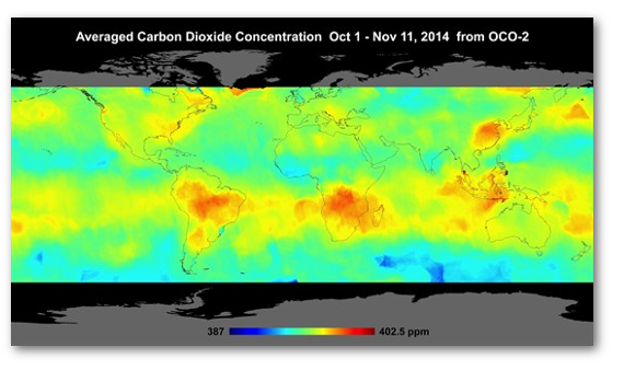
Climate: carbon budget Over the years I haven't really devoted much time to the carbon cycle, but I wonder if some of the attention of the climate debate will be switching to this area with the advent of the Orbiting Carbon Observatory, a satellite deployed last year to measure carbon dioxide concentrations across pretty much the whole planet.
The first maps were presented at AGU last month and the data is now publicly available:
 Anthony has an interesting guest post from geophysicist Martin Hovland, which looks at some three hotspots that appear to be associated with subsea volcanic vents. I'm not sure whether these are of sufficient magnitude to provide backing for Ian Plimer's hypothesis about volcanic contributions to the carbon budget, but at least this represents a start in resolving the issues.
But the maps raise lots of other interesting questions too, at least for someone like me who is not particularly up to speed in this area. NASA seem to think there are no great surprises. Perhaps readers know some of the answers. For example, the low CO2 concentrations in the UK make no sense to me. And I wonder why India should have such low concentrations when China is so high. Why is there a hotspot in Greenland? And what is that one in the South Atlantic.
So many questions, so little time for reading.
Reader Comments (89)
Is the "data" 'unfiltered', 'raw', 'unadjusted'? Who decides the colours? How is the "measurement" depiction calibrated and against what 'gold' absolute? What are the normative values / colours?...please don't keep me in suspense....I'm simply dying to know.
When some new measurements appear which may contradict your long held position then one way to conceal that is to say "it's what we expected/there are no surprises in the data". Like everything in clisci it's the first statement that lives longest.
From what I have read (not much admittedly) if not a total surprise this wasn't predicted. Like a lot of sub-sea volcanic activity our knowledge is pretty limited if not non-existanant.
Is it of significance that the rain forests (the earth's lungs) have the highest concentrations?
My understanding is that trees are net carbon sinks for the early part of their lives - after that bits fall off and they eventually die and become net carbon sources.
Has to be like that otherwise all the carbon would end up locked up in trees and biological processes would come to a halt.
So if most of the CO2 emmissions are from the southern hemispher why are the northern industrial countries having to suffer carbon reductions?
SandyS
Like a lot of other things about the earth, our knowledge is pretty limited. It looks as if the climateers are starting to discover the hard way that things out there are not as straightforward as they [want to] believe. 2015 could prove an interesting year.
There is an explanation on
www.geologist-1011
It would seem that most atmospheric CO2 is volcanogenic.
Natural that is, not man made.
The base number is 387 and the top number is ~403 so the range is just 16ppm. Basically it seems to be saying that overall the level is around 395 with a trivial variation above and below. I'm not sure there is really much there.
Murry Salby
I no longer attempt to read any of the Climate Science literature, having resolved long ago that much of it was incompetent, dishonest, or both.
When last I looked, however, there seemed to be a 20% error in the accounting for carbon flows into and out of the atmosphere. Does such a discrepancy still exist?
This is what I dont get.
SURELY having more Co2 in the air means more of it gets absorbed by the seas which means we should have more plankton in the oceans and if we have more plankton on the oceans gobbling up all that evil Co2 then isn't this a good thing for everything that feeds on plankton and then everything that feeds on everything that feeds on plankton?
And if the planet is greening because of the minor increase in Co2 AND the planets warming has been statistically insignificant then Im failing to see the downside here of having more Co2 in the atmosphere???
Mailman
It's like a sticom -- we're at the episode where the greenies discover the Earth is mostly melted rock and we're all gonna melt but it's a race with human generated CO2 and volcanos.
I'd like a comprehensive comparison to the modelled CO₂ released by NASA in November. I'd also like the 2 to have the same colour code, but currently they seem to be completely opposite with regards to legend.
It's a pain in the arse as a colour blind chap.
...NASA seem to think there are no great surprises....
How CAN there be any surprises? There had BETTER not be any! The Science is Settled, after all...
Jan 2, 2015 at 10:41 AM | Old grumpy
It seems that the idea of the rainforests being the lungs of the world doesn't actually stack up:
Professor Philip Stott, Emeritus Professor of BioGeography at the School of Oriental and African Studies, University of London, wrote this in 2003:
“At the end of the last ice age, only some 12-18000 years ago, the tropics were covered by seasonal savannah grasslands, cooler and much drier than now. There were no rain forests in the Malay Peninsula and much of Amazonia, and, despite the increasing human development of forested space, there are still more rain forests persisting than existed then. As in Europe and North America, the forests came and went as climate changed; there is no Clementsian “long period of control” under one climate. Beneath many rain forests, there are sheets of ash, a testimony in the soil to past fires and non-forested landscapes.”
He still maintains a site here:
http://www.probiotech.fsnet.co.uk/trfseminar.html
And then there is this:
“Brazil: Ancient Amazon Actually Highly Urbanized” August 31st 2008
“The report in Friday’s edition of the journal Science, describes clusters of towns and smaller villages that were connected by complex road networks and were arranged around large central plazas. Researches also discovered signs of farming, wetland management and fish farms in the ancient settlements that are now almost completely covered by rainforest.”
http://en.mercopress.com/2008/08/31/brazil-ancient-amazon-actually-highly-urbanized
And this:
“Stone age etchings found in Amazon basin as river levels fall”: 10 November 2010 Guardian
“Archaeologists who have studied the photographs believe the art – which features images of faces and snakes – is another indication that thousands of years ago the Amazon was already home to large civilisations.
http://www.guardian.co.uk/world/2010/nov/10/amazon-brazil-stone-age-etchings?
And then this:
SOUTH AMERICA DURING THE LAST 150,000 YEARS – Jonathan Adams, Environmental Sciences Division, Oak Ridge National Laboratory
“In general, it would seem that 150-130,000 y.a. the continent showed the general glacial-age pattern of colder and more arid conditions. After about 130,000 y.a., climate warmed and moistened and the forests reached a similar area to the present. After 115,000 y.a., cold and aridity began to influence the vegetation, to an arid, cool maximum around 70,000 y.a., followed by erratic but generally fairly cool and drier-than-present conditions throughout the continent. A second cold, arid maximum began around 22,000 years ago and lasted until about 14,000 14C y.a., after which rainfall and temperatures increased and the forests returned over several thousand years.”
http://www.esd.ornl.gov/projects/qen/nercSOUTHAMERICA.html
I wonder what sort of CO2 maps would have been generated from those different periods.
Only 3-5% of CO2 is anthropogenic.
The remainder ?
97% of climate scientists agree that this new data is a significant development, in the field of obtaining lucrative grant funding.
The measurements don't fully support the expectations of the warmist academics. Never mind, a bit of adjustment here and homogenization there will sort it.
387-402.5 ppm - its not exactly a huge variation, is it..?
Anyway - I thought that the global average had crahed through the 400 ppm barrier - implying that we were on the downward path to hell and damnation. Seems to me from the map that, on average, the global average concentration is still WAY short of 400 ppm....
I hesitate to suggest that climate scientists have been 'cherry picking' again...
Without needing to actually look at the data I can assure everyone with 95% certainty that the numbers are all consistent with the projections of the GCMs and with all of James Hansen's predictions. Or else it's worse than we thought.
I'm not sure a snapshot, albeit with a long exposure give a lot to work with. Be good to see what happens over the course of a year. Any bets that that band moves north with the sun to some extent?
Also worth remembering that these are atmospheric concentrations rather than sources. Shouldn't we be considering processes that might re-concentrate co2 in the hotspots? Could this overpower the signals from the sources? Except for China of course. And as most western countries have exported their manufacturing there this is the only thing that is not a surprise.
I think the map is easy to understand once you grasp some advanced climate science.
Once "Carbon" is emitted anthropogenically (to use the name for CO2 that the government calls it), it realises that it needs to get to a sink. The naturally occuring stuff doesn't have this need, it's natural. The manmade stuff understands that it is not natural and so needs to get to a sink quick.
It's pretty far fetched to think that all winds blow towards rainforests, even basic level Climate Scientists wouldn't suggest that. So how does it get there? It makes sure it bets noticed by a carbon monitoring sensor and then winks out of existence in Birmingham, or Paris etc., and winks back into existence in the Amazon or central African rainforests. Then it just hangs around waiting to be absorbed by a tree, or watched by a satelite.
The natural stuff has a different job, it has to manage the Mauna Loa data. It makes sure that 5 parts per million of atmospheric "Carbon" leave the Hawaii area at the end of the year, and about 6 to 7 parts per million go there from other areas in the summer. Managing the rota, contacting the next due molecues, notifiying the ones selected to leave is an important job, and completely unpaid.
Hopefully within half a million years we will have forgotton about monitoring how much carbon there is in the atmosphere, and they can stop. Otherwise it's going to get a bit unpleasant breathing in Hawaii.
Carbon is almost as magical as that tree in Yamal!
This pattern has been observed from space for many years by GOSAT and SCIAMACHY. The part of the pattern shown here emphasizes agricultural burning across Brazil and Central Africa. You can get an idea of the pattern changes over a year here. Also here but not so prettified but with some links to papers.
Finally, it's a new year, try not to be so silly.
The action of the sun on the earth's biome inevitably drives carbon{from vulcanism} into virtually irreversible lockdown, see hydrocarbon deposits and limestone. Vulcanism fails to keep the atmospheric CO2 level up, and but for man's timely intervention with the hydrocarbons, and man's minimal warming and maximal greening effects, the earth was inevitably headed for permanent icecaphood.
Mebbe. Mebbe we're just too impuissant.
====
"The part of the pattern shown here emphasizes agricultural burning across Brazil and Central Africa"
Well, interesting, but the CO2 map is dated Oct-Nov, the beginning of the rainy season in central/southern Africa, exactly the season when things don't get burnt. The peak burning season is the early-mid dry season when the grasslands are dying off, ie in April/May.
Once trees reach their 'adult' size and cease to grow, like all other living things they respire, taking in oxygen and giving off CO2. This is balanced during the day by a level of photosynthesis to provide energy to all the living cells in the tree. But it would appear that plants are only carbon sinks during their growing stage.
Perhaps a botanist would care to comment.
The Greenland hot spot is probably due to the ongoing eruption at Bardarbunga, (http://en.vedur.is/earthquakes-and-volcanism/articles/nr/2947) which is also putting out significant amounts of sulfur dioxide.
Haha, that's some pretty widespread "agricultural burning". You'd think someone might have noticed.
Ian W asked about tree growth and carbon dioxide uptake. A recent paper suggested that large trees (counterintuitively) continue to be net carbon sinks http://www.nature.com/nature/journal/v507/n7490/full/nature12914.html
"Finally, it's a new year, try not to be so silly."
That's rich coming from someone who thinks he's a rabbit.
Jan 2, 2015 at 1:40 PM | Unregistered CommenterEli Rabett
Your usual BS. Don't you get tired of mis-reading data.?
If you look at the time lapse simulation of CO2 concentrations here: https://diggingintheclay.wordpress.com/2015/01/01/mists-of-time-missed/
And stop it around 2006/10/14 it matches the OCO map quite well, really no surprises. According to the audio on the time lapse simulation the higher CO2 levels in South America and Africa are indeed from the burning of fires. The CO2 hotspot near Greenland is a result of a swirling motion from the CO2 produced in the USA.
I'm with Judith Curry on this one, the evidence for man made CO2 increase by burning carbon fuels is extremely robust.
The evidence that rising CO2 concentrations in the PPM range will change the climate or cause significant warming is, on the other hand, very weak.
Stephen Richards
Actually Eli Rabett is correct - you can see maps of fire activity here, and if you scroll on to October 2014 you can clearly see the fires in Brazil and southern Africa.
Richard, the MODIS data shows mostly 0.1 fire per 1000 sq. km savanna land. Does this produce the marked local CO2 difference seen in the map above?
Second question is, the CO2 map over the Amazon well extends over Central and Western Amazon - Acre, Mato Grosso etc. Though there is deforestation, these areas are clearly not savannah. Why is CO2 high there?
Third is, why is household fuel burning not evident over the Northern Indian peninsula? In fact, it looks rather unremarkable.
That is just one of the points I have problems with. Human sources are largely constant, so there should be a constant plume traceable back to the source, which is clearly not the case for human emissions. I was given to believe that the OCO2 would have the resolution to show this. Also, the North Atlantic off Greenland is useually reported as a sink, not a source.
Generally, I think it's too early to tell how useful it is going to be. At the moment I'll still make the working assumption that data is going to be presented honestly and openly. But I'm rather disappointed to see that supposedly 'dynamic' preliminary data from a satellite presented as a single snapshot that represents data accumulated over six weeks! How useful (or useless) is that?
Perhaps I misunderstood, or was oversold, the capabilities of the instrument, but I am most disappointed to see no data from the polar regions. I believe there is a ground reference point for satellite calibration at Alert or some high-Arctic Canadian location. Why no data?
It must surely be a matter of supreme irony that the birthplace of the Industrial Revolution, England, has far less CO2 than the northern Sahara!
But more to the point, where is the devastating fingerprint of anthropogenic CO2 on this map? It is absent. The pattern appears to me to be consistent with what one might expect from the global biome - hotspots of CO2 clustered near to the major tropical rainforest areas and, over the oceans, highest in areas where plankton are richest in number.
The idea that these vast areas of elevated CO2 over southern Africa and south central America are due mainly to burning just doesn't seem that plausible to me. However, if such is the case, then obviously contributions to global CO2 emissions from forest fires in tropical savannah far exceed that from NH industrial activity.
I made the following comment on Verity Jones' site:
[go there to see the caption I mention]
HAPPY NEW YEAR !!
Regarding the image “Averaged Carbon Dioxide ….” about 3 pages down and has a supplied caption under it.
I saw this elsewhere and noted the small red spot over western Oregon & Washington. I don't have a clue as to why this should be.
In the caption there is: “ ...concentrations are highest above northern Australia, southern Africa and eastern Brazil.”
The author is geographically challenged, and a poor wordsmith.
“above northern Australia” should be Indonesia. Australia seems to be a pale green on my monitor.
Maybe the author meant to say north of Australia, but why? The area over which the red color is has a name.
Also, “eastern Brazil” is mentioned. The bright area appears above the Serra Do Cachimbo (Cachimbo Mountains). To me, eastern Brazil is that part near the Atlantic Ocean, about 2,000 - 2,500 km away.
I think they got so excited about this – like a little Yorkie jumping up and down when the doorbell rings – they failed in its presentation.
I await further developments.
@Redbone: "The CO2 hotspot near Greenland is a result of a swirling motion from the CO2 produced in the USA."
What exactly are you talking about? - a 'swirling motion' inherent to the CO2 emissions. or, a 'swirling motion' in the atmosphere that causes the CO2 hotspot?
[Snip - manners]
[Snip - Response to snipped comment]
Michael hart
The data resolution may be because it's in a polar orbit so scans the Earth fully every 16 days (according to Wiki). So 6 weeks should give better resolution and may lessen artefacts. It's probably a compromise between noisy data and dynamics.
Micky H Corbett, but would a polar orbit not mean that it passes over the pole (or close) every day? I would have expected that to produce good polar data, but there is none presented at all. I must be missing something.
I'll cross-post a question I just asked at WUWT:
(from here which is consistent with what I have read elsewhere)
Hence a large fraction of the added fossil CO2 should be coming, continuously, from a tiny fraction of the area. If (IF) this amounts to at least 3ppm per year, then allowing for a ~100 fold concentration over urban areas, and the color scale on the map, I would expect to clearly see this in the OCO data.
I don't see it. Why not?
The distribution shown does not make a great deal of sense. I have not got a clue about any of the major factors, never mind the details, but if I were to guess, it looks more like a distribution of smoke.
The other aspect I have not seen comments on yet is this: October through Nov11 seems well into the Southern Hemisphere growing season, though not yet mid summer. But, mixing my metaphors, the big sucking sound of CO2 sinks appears to be only the southern oceans, much of which we cant see. This certainly doesn't surprise me, but the next few data sets should be more revealing. Hopefully there will be some better data. To my eye, the swirl of the patterns appears qualitatively "distinct" to much of the other data.
@ alleagra: "Belittling comments .... add precisely nothing to the discussion"
Please explain how your comment does?
"...For example, the low CO2 concentrations in the UK make no sense to me...."
A nation of shopkeepers makes no CO2. Especially if they're mostly selling each other goods made in China. Sorry.
Further to what Eddy said above about the range being only 15.5ppm, my problem with the presentation is that the temporal resolution is 6 weeks, the spatial resolution 32km square and the instrument error, I understand, +/-1ppm. That coupled with all the other problems discussed makes the map not worth the pixels it was printed on.
This general pattern has been observed at this time of year quite often now - it is not exactly new. Fires are blamed, but when you look at the fire maps, they are in the wrong places - the African fires are in the Sahel just south of the Sahara, but the CO2 peaks over the Congo, a few thousand km south.
I have long been happy with the pattern showing concentration via the Equatorial Convergence. Lots of CO2 in the southern spring, swept together by the winds moving together in the convergence zone. In the northern spring, the CO2 similarly peaks along the Equatorial Convergence which by then is further north.
George Monbiot....pls call your office, Newsnight want to hold a debate between you & Ian Pilmer...
shub
Were you looking at November 2014 or October? In the October map it seems there's anything from 0.1 to upwards of 10 fire pixels per km2. But anyway, this is only showing where fire is detected in a pixel (not sure what the resolution is), it doesn't say anything about intensity or extent so it's hard to say what the emissions would be and how much this contributes to the CO2 shown in the OCO plot. However it does show that the regions of higher CO2 over tropical land are in areas where there are fires.
Re: central and Western Amazonia - I think you've answered your question yourself, it's probably deforestation as you say.
Re: household wood burning in India, if this is indoors then it wouldn't be picked up by MODIS.
The_Iceman_Cometh
I think you've looked at the March 2000 map which is the default when you first look at the MODIS page. You need to scroll forward to see October and November 2014 to see the maps that I'm talking about.
Michael Hart, Jaime Jessop and others, it's important to realise that (as some have pointed out) the CO2 map is only a few weeks of data. Importantly, it's at the time of year when northern hemisphere CO2 is at it's lowest (see the Mauna Loa data). Through the NH summer, growing vegetation takes up CO2 so atmospheric concentrations are reduced - from November onwards, CO2 starts to rise again after the fallen leaves of autumn decay and release CO2 back to the atmosphere.
Also I think the map probably shows average CO2 concentrations throughout the depth of the atmosphere, rather than just at the surface, so this includes regions higher in the atmosphere where CO2 is spread around more by the wind. Hence you wouldn't expect to see fine details relating to surface sources and sinks.
Stephen Richards, if I may say so, I think actually it's you that needs to grow up! There's some people here trying to have a sensible conversation about a perfectly reasonable and interesting question posed by our host. As alleagra points out, your juvenile little snarks only reflect badly on yourself. But anyway, Happy New Year and please do try to lighten up in 2015….!