Tuesday
Dec182012
by  Bishop Hill
 Bishop Hill
 A triumph of hope over repeated failure
 Dec 18, 2012
  Climate: Models
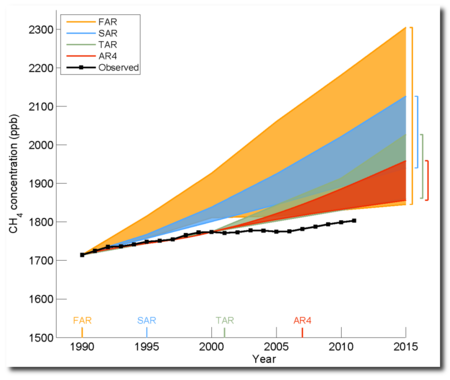
 Anthony posted this startling image from the IPCC's draft report. It shows the forecasts of atmospheric methane concentrations from the earlier assessment reports and how they have turned out against reality.
Forecasting is difficult. Especially of the future.


Reader Comments (10)
Heavens...that has to be wrong.
Surely temps are up with the CO2.
How sad that the IPCC gets stuff wrong.
Oh well.
> Surely temps are up with the CO2.
Read the label on the y-axis. That's not a graph of temperature.
I like the way the uncertainty decreases with each successive model, but the predicted levels still fall within the range of the first wildly overestimated figures. And the way each new run is adjusted down to start by matching the actual figure before the predictions start wandering off again.
The bottom of the scale being omitted is presumably from the original IPCC reports. Just once I'd like to see graphs drawn with the full scale, rather than something that wouldn't be out of place here:
http://www.amazon.co.uk/How-Lie-Statistics-Penguin-Business/dp/0140136290
Regardless of the IPCC's junk science predictions/projections, from the graph, it looks like the observed atmospheric methane levels have increased by about 80ppb in the last 21 years. To put that in context, that's from 0.00000171% to 0.00000179%. I am very worried that Planet Earth won't be able to cope with this sudden and significant increase. </sarc>
Whenm I worked for an oil compnay I took a short course on petroleum econmics. They showed a similar graph for future oil price predictions. They called it the "hedgehog" plot. All the predictions at any point in time were up, reality always trended below. The future is not the present extrapolated.
Will that get into the SPM? I doubt it. At this rate, the IPCC itself might be phased out as being less than helpful for ' the cause'. Why draw attention to a scientific case which is so full of holes, especially now that more and more subject matter experts are jumping on the blunders so quickly?
I hope one day there will be a virtual encyclopedia assembled on the greenhouse scare, and how it came to have such an impact. A large section would be needed for the shortcomings of the IPCC leadership, practices, and content. The bulking out of their output by including good work here and there is not enough to compensate for the spinning, the exclusions, and the monotonous pushing of the article of faith that launched the whole squalid business: greenhouse alarmism. It was to be developed as a big stick to help achieve the political ends of a few fanatics. Their astonishing success in doing that deserves to go down in history as evidence of the vulnerability of our societies to well organised zealotry and fearful propaganda. We saw several very violent examples of that earlier in the 20th century. We are now witnessing a peaceful one.
The world would be a better place without it. But the forces of reason, of rationality, of decency and high moral and intellectual standards, seem feeble in the face of highly organised campaigns which take over the mass media, political parties, and other institutions, with an ounce of truth and a ton of speculation and blatant scaremongering.
Correlation is not causation but the observed trend in atmospheric methane would appear to match the rise in vegetarianism :-{
Compare what the IPCC says in the ARS, they said in the FAR
here
to what the IPCC said in the AR4, they said in the FAR
here
There is a difference between the two.
@ssat more likely it matches the rise in tobacco use
I don't understand the graph. At the time of the TAR the observed CH4 concentration was below the "projected"/modelled value at the time. By AR4 the observed CH4 concentration was lower than the "projected"/modelled value by approximately the amount of the model uncertainty (width).
I'm mystified as to how one can publish model projections that are so poor and not get laughed off the stage!
Also there seems to have been no adjustment/improvment, at AR4 particularly, of the model algorithms.
From the look of the graphs the errors at FAR seem to be the same as in AR4 - it looks like they fed in a new intial value and ran the projection forward from the new start point (which was not near the observed value) and it simply churned out the same dramatic exponential trajectory and the same error margins.