


Sunday
Dec132009
by  Bishop Hill
Bishop Hill Blast and counterblast
Giorgio Gilestro takes issue with Willis Eschenbach's attack on the credibility of the adjustments at Darwin. One should, he says, look at the big picture, and proceeds to an analysis of the adjustments showing that they are normally distributed and average to zero (i.e. there are as many upward adjustments as downwards ones).
Hooray! says RealClimate author Eric Steig in the comments:
This is a very nice analysis, and is really the last word on this entire fabricated scandal.
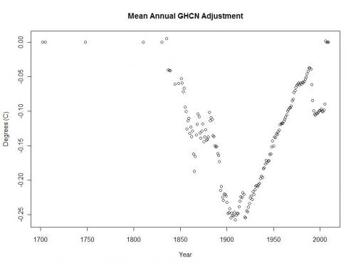
The last word? Not so, says Climate Audit regular, retired statistician Roman M, who produces this rather amazing graph of how the adjustments pan out over time.

Reader Comments (35)
I see "SOD" who posts around was first in the cheerleader's list in comments. Care to change your mind SOD, GG did a nice bit of work, but unfortunately his analysis, by excluding any time dimension, is worthless in deciding if there was any affect on the trend in the adjustments.
A further question on this. Why is the Giorgio Gilestro bell curve centred on zero? I thought these adjustments were meant to be to take account of particular local circumstances at a weather station. It doesn't strike me as self-evident that those adjustments should be randomly distributed in such a way that the average to zero over this long period. To take just one example, the urban heat island effect should presumably resulted in a predominance of negative adjustments, so will have to have been balanced by a precisely equivalent amount of negative adjustment for all other purposes - odd that everything evens out. Maybe there's a good statistical reason for this. Can anyone explain it?
V for Victory!
Useless internet analogy time. Stealing money then paying it back at a later date doesn't absolve you of your initial crime. It is common sense to consider that an average adjustment of bugger all can still produce an upward trend - adjust the first half of the data downwards and the second half upwards by the same amount.
On Eureferendum Manchester Airport's temp. record came up for discussion. I reckon the adjustments remove the UHI trend but not the effect - the adjustments get smaller as you move forward in time. Yet time is a crucial metric in the discussion of climate change. I am not a statistician, are any of these 'climate' 'scientists'?
"V for Victory!"
Or V for Vendetta! Blow up the New Bailey. (BBC)
Nigel, great observation (which I made as well on the Statpad blog: http://statpad.wordpress.com/2009/12/12/). Further, why would adjustments form an almost perfect, unskewed, although leptokurtic, distribution? As you say, if nothing else, adjustments for UHI should skew the distribution negatively. GG's distribution suggests something "unnatural" about the adjustments, which, of course, Roman M makes brilliantly clear.
I thought there had to be something wrong with that GG analysis. It appears he thinks "trend" means "change in average for the period", not "change in annual averages over time".
I think the scariest thing is why the number of met stations should plummet just as temperature data (so they say) suddenly becomes vital for the future of the world. It's almost as if they don't actually care about the real temperatures out there...
Might the plummeting of the Met stations be related to a switch-over to satellite data, suitably homogenised and adjusted a la Darwin?
I think the decline in stations is a result of the collapse of the Soviet Union. If I recall correctly, a large number of Siberian stations were closed when the USSR fell apart.
Of course, the alarmists have assured me over and over that the loss of all these colder-than-average stations was properly "compensated" for in the data.
It wasn't just in Siberia, there was a great die off of stations in the US used by GHCN and has been documented by Chiefio on his site. Right now GHCN uses something like 136 stations in the US down from a high of 6,000.
Why don't we just dispense with the BS and throw out the intstrumental records altogether and replace them with data provided by a consensus of IPCC climate scientists? Let's just admit that there is an over-arching global temperature signal that can be statistically derived at every point on earth. And this signal is a far better metric than what any mercury thermomter.
One should actually expect a steep downwards slope for adjustments as one approaches now from UHI.
Your adjustment is inherently trying to remove the effect of cities - which are generally insignificant slices of their gridcell, and thus bad representatives of the average gridcell temperature. So the adjustment should be a subtraction.
And yet, we see a steep upwards adjustment instead. Well done.
Doesn't matter. It's been answered. Time to move on.
This is all based on the GHCN version 2 that just came out. As I understand it:
1. The number of stations has fallen dramatically.
2. The sites that have been eliminated have been, by a significant degree, tilted toward the "cold" stations.
Shouldn't the adjustments be biased toward the negative side to make up for this?
PS I don't believe the UHI effect matters here, because (again, as I understand it) the GHCN doesn't include any adjustments for that.
I looked at GG's code - like written by a ten year old. I hope he doesn't do this kind of thing for a living.
Ed Snack, Phil A etc. You've got this totally wrong. Giorgio has patienly explained it over and over. I have reproduced his calculation using R.
What he does is compute trends. This of course incorporates time. When looking at Darwin, the figure Willis calculated was that the adjustment changed a -0.7 C/century trend to a +1.2 C/century trend. A change of +1.9 C/century, which is indeed large.
What GG did was to do just this same calc for the other 6753 stations in the same dataset. The resulting set of trend changes is his histogram. And it shows that the 1.9 figure is atypical. It's in the top 10%. The others are spread more or less evenly on either side of zero.The mean trend change due to adjustment is 0.175 C/century.
That's still noticeable. But it doesn't sustain Willis' underlined charge, which was:
Those, dear friends, are the clumsy fingerprints of someone messing with the data Egyptian style … they are indisputable evidence that the “homogenized” data has been changed to fit someone’s preconceptions about whether the earth is warming.
Nigel #2
The reason the distribution centres on zero is simple. A large number of stations had no adjustment at all.
Giorgio's analysis was a pretty good indication that issues like Darwin station may not be causing major problems overall. However, the USHCN (USA) adjustments are much greater than the GHCN (global) ones. Here is the graph above overlaid with the adjustments found for the USHCN.
I was wondering if Eric Stieg had ever considered the possibility that some people might think that his personal/scientific credibility may be affected by his eager support of anything that appears to support his own position
Nick,
I'm glad you think 1.9 deg/century is large.
Giorgio didn't seem to blink an eye at it:
Phil A:
A late friend who was a meteorologist who'd done a lot of modeling of the atmosphere told me about this reduction back in the late 1990s, saying, "WTF? Why would anyone want less data points as we go forward in time?" He thought it was insane.
Viv Evans:
Didn't John Christy's work on the satellite data actually show much less warming than the met stations?
John M
No, I don't think GG mentioned Darwin there. What people don't seem to be noticing is the difference in scale here. The average, 0.017 C/dec, is about a tenth of the Darwin figure, and it isn't large. Certainly not something you could base Willis' skullduggery claims on.
The figure at the head of this post seems to impress people, but the numbers are small there too. The gradient of that seemingly impressive uptrend is about 0.023 C/decade, very comparable with GG's average.
The shape is surprising though isn't it?
GG is a wally. It is not the distribution corrects that matter, it is their serial correlation; i.e.: negative early and positive later.
As for Steig! The more I read aout these climate scientists is that they don't seem to have a very good grasp of basic scientific technique.
"The shape is surprising though isn't it?"
No, not really. Remember, it is not a plot of the size of each adjustment, but of the cumulative effect of adjustments. If you thought of GG's 0.0175C/decade average trend as being caused by a more or less uniform likelihood of adjustments happening in any one year, then a downtrend in this plot of 0.0175 C/dec is what you'd expect, and close to what we see. The deviation comes back in about 1900, when the probability seems to shift to having aadjustments of a nett cooling effect. However, the number of stations also diminishes there.
The spread of adjustments is much greater than the relatively small difference of the mean from zero. At a guess, I'd say that going back through the C20, about 45% of adjustments are up, and 55% down. In C19, that switches to about 60%up, 40% down (these numbers just for illustration).
The time-dependent adjustment is exactly the problem. Most people agree that the Earth has been warming; longer term since the last ice-age and shorter term since the end of the "Little Ice Age" in the 19 century. Adding the V-shaped adjustment to a steady upward trend will flatten the earlier part and steepen the later part. The result is the "signature" of CO2 emissions-- proof of AGW! The fact that the average trend of the adjustments equals zero is irrelevant.
The average trend isn't zero. It is 0.0175 C/decade, as GG said. The point is that all those nett figures are small, including those in Roman's graph. And there actually is a reason for them.
I have two problems with Giorgio Gilestro's/Nick Stoke's bell curve:
First, how come the adjustments have a mean effect of zero? I'd have thought, given the well-known urban heat island effect, the net effect would be negative. Maybe there's something I've misunderstood there. Or maybe there's some other factor I'm unaware of that's as big as the UHI, so it cancels it out. Is there?
Second, what if fraudulent adjustments have been made, not to increase the total warming, but to create a false impression of accelerating warming? Suppose, for instance, the adjustments were designed to turn a straight line into an upwards-turning parabola, with the same end-points? Would I be right in thinking that your analyses would be unable to detect this, given that there would be no effect on the overall trend (measured as a simple difference between temperature at start and temperature at end)?
Bruce,
First on point 1, the average effect was not zero but 0.0175 C/decade warming. The GHCN homogeneity is a break detection algorithm - it tries to detect discrete changes, such as equipmeny change. I don't think it claims to adjust for UHI.
I might add that it's unclear what is done with this adjusted file. It isn't used by GISS or Hadcrut. It might be used for NOAA graphs. Maybe people apply further adjustment for UHI.
On your second point, Romanm's graph is actually fairly straight during C20, with a downturn at the end. You should ignore the anomalous endpoints - they are based on very few stations, so they won't affect any aggregates. The total rise is small anyway, but the only acceleration that could possibly show is around 1900. I doubt that advances anyone's argument.
.
Bruce
Yes, the postings in question are only about the homogeneity adjustment. UHI and TOBS are separate. TOBS is the big one as far as I know.
Nick
I may be missing something. Roman is showing the average adjustment in any given year I think. If average adjustments in C19 were gradually becoming more and more negative this implies more and more shifts to warmer sites. Then with the arrival of the new century, this trend is reversed and they start moving stations to cooler sites. Am I getting this correct? What happened in 1900?
I can't help but be reminded of the Hockey Stick itself where the behaviour of the graph suddenly changed in 1902 (neatly coinciding with the start of the calibration period).
The main thing that happened around 1900 was the introduction of Stevenson screens.
OK, that's plausible. What was causing the shifts to warmer sites before 1900? And isn't the linearity still very surprising?
The graph represents the cumulative effect of adjustments. The linearity says that during C20, there was a constant bias, small relative to the spread, towards negative adjustments.Going back before about 1900, that bias changed to positive.
Incidentally, Wiki tells me that the engineer who designed Stevenson screens was the father of Robert Loius.
My reading of Roman's post was that this was the average adjustment for any given year. Where are you seeing that this is the cumulative effect?
The figure for 1950, say, is the average difference between 1950 adjusted values and unadjusted. But for each station that difference is the sum of adjustments that happened between 1950 and 2009. For the population, you can consider it as the cumulative sum of adjustments.
A starting point model for the population of stations is a sort of random walk (back in time), where in any year there is a finite probability of an adjustment up or down, with a slight bias toward down. As you pass 1900 (going back) that bias shifts to up.
I took my first loans when I was not very old and it supported my relatives a lot. However, I need the commercial loan once more time.