Saturday
Apr232016
by  Josh
Josh
 Josh
Josh Gav loses it - Josh 371
 Apr 23, 2016
  Gavin Schmidt
  Josh
Josh  NASA
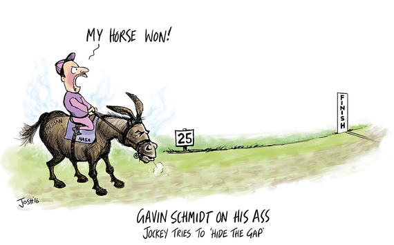
NASA When Steve MicIntyre writes "In the past few weeks, I’ve been re-examining the long-standing dispute over the discrepancy between models and observations in the tropical troposphere." you might think you were in for a bit of a technical post - which, of course, it is - but it is also also very funny and well worth reading. It also inspired the cartoon below.
Click image to enlarge
H/t commenter 'See owe to Rich' for the 'hide the gap' phrase.


Reader Comments (155)
I've already explained several times to you Phil, it's like plotting GISTEMP on a 1951-1980 baseline, then plotting the exact same graph on a 1981-2010 baseline, and getting confused as to why the data point for 2015 is at a different point on the Y-axis on each graph
That is precisely what Gavin wanted to demonstrate.
There's also the wee point that Gavin is plotting the same thing, with shifted baselines to illustrate, um, the effect of shifting baselines. This is legitimate and useful.
The long and tedious comparison between the 'climate lab book' graph and Christy's graph is comparing Christy's temperatures in the tropical troposphere with the global surface temperatures.
I pointed the CLB chart as a exposition of the combined effect of Christy's cherry picks. To try and compare across the two while ignoring all the cherry picks but one is indeed to compare apples and oranges.
'F' for comprehension.
Not got time to respond at the moment, but all he showed is that if you put anomalies at a different baseline you get a Y-axis shift. So what? Both baselines are valid, and have similar spread.
As I explained, if you align the X axis to a common baseline, after 20 years the constant radiative forcing embedded in the models makes them overlap almost exactly. I show this in an animation I put on twitter here:
Twitter link
As I show, both baselines yield pretty much identical spread and Y-axis position in the regions that matter, as long as you use a sensible abscissa (i.e., the time after the models and observations are forced to converge).
I'm sure you'll all be glad to know I'll be offline for the next week or so. Have fun!
Spence,
No, he didn't. Try reading it again, this time with your eyes open.
I genuinely don't care, one way or the other.
Gavin
Its spread, rather than a simple translation up or down. But hey, this is a guy who cannot tell global with tropical, troposphere from surface and a single scenario from a range.
'F' for comprehension, 'U' for humility.
'A' for arrogance though.