Spin this - Josh 375
May 14, 2016
Josh in Ed Hawkins, Josh

Following Ed Hawkins lovely Global Temperature Change spirograph I thought I would add a few more centuries of data. Just for balance.

I created the little video (using an iPad) based on the graph from Dr. Judith Curry’s presentation (Hannhijarvi et al slide) but it is only an approximation. Ed's version for comparison is here.

Cartoons by Josh


Update on May 16, 2016 by Registered CommenterJosh

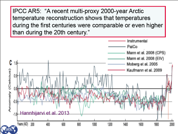
It seems a couple of readers have had a hard time following the links and locating their AR5 so here is the IPCC graph that the cartoon very approximately represents.

Article originally appeared on (http://www.bishop-hill.net/).
See website for complete article licensing information.