This is odd. Or do I mean appalling?
When you measure the surface temperature, the data that comes out of the station network is poor, and has to be "fixed". This is done by means of a series of adjustments which are added stepwise to the raw data to give the final answer.
I've show below a graph of the difference between the raw temperatures measured in the USHCN surface station network, and the final temperature delivered as an output.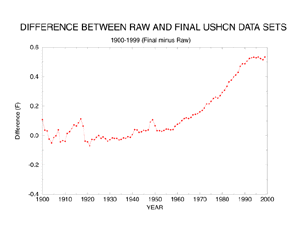
What this appears to show is that most of the observed warming is coming from the adjustments, not the weather stations. (I'm assuming here that the trend in the final temperature is not more than 0.6oC)
The page from which the graph is ripped explains what the adjustments are:
- Time of observation. Different stations measure temperature at different times of day, but you want every station's midnight temperature. You therefore adjust anyone who is not reading at midnight, creating an estimate of what temperature it would have been if they had have done it at the correct time.
- Station moves
- Changes in equipment
- Missing data
- Urban heat island - as urbanisation takes place, an man-made warming trend is introduced, which needs to be eliminated to give the true temperature.
It also gives the impact of each. In the graph below, each line represents one of the adjustments.
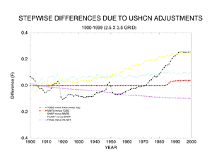
From this, we can see that the warming trend is being produced by the time of observation adjustment (black) and by the station move adjustment (yellow).
I can think of no earthly reason why time of observation adjustments would produce this shape. The upward slope of the adjustment implies that there are many stations recording temperature at a time when it's colder than midnight. This means the wee small hours I guess. Why would this be? And why would the effect be increasing? I mean, over the last century more and more stations will be automatic, which presumably means that you could get temperature exactly when you want. Why then, does the raw data appear to be getting worse - ie the adjustment required to correct it is getting larger?
It all looks a bit fishy if you ask me.