While I was at the Met Office the other day, I had a very interesting presentation from Jeff Knight, who IIRC runs the season-to-decadal forecasting unit there. Jeff's talk included discussion of a paper that Lucia had looked here. Lucia's comments are, as always, very interesting and address a range of concerns that I'm not going to touch on here. The paper itself is here.
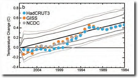
The headline image of Jeff's talk was what the Met Office refers to as "the Celery Stick" graph, which assesses the range of model predictions against data:
 ENSO-adjusted global mean temperature changes to 2008 as a function of starting year for HadCRUT3, GISS dataset (Hansen et al. 2001) and the NCDC dataset (Smith et al. 2008) (dots). Mean changes over all similar-length periods in the twenty-first century climate model simulations are shown in black, bracketed by the 70%, 90%, and 95% intervals of the range of trends (gray curves).
As can be seen from the graph, CRUTEM is on the cusp of falling outside the envelope of the projections of the models, although this was surprisingly of little concern to the Met Office. As we saw a few weeks ago, the new version of CRUTEM will be issued soon, and will have an increased warming trend, which is apparently the result of a reassessment of warming in the Arctic. This involves a shift from the "admit our ignorance" approach used now to a new one incorporating a GISS-like extrapolation. The enhanced warming will shift CRUTEM back towards the centre of the envelope of the models.
This bothers me. It seems to me that for assessing model peformance, you should only compare models to data, not models to data-plus-extrapolation. If we don't know anything about the Arctic, then we should presumably test models versus data only for those regions of the planet outside the Arctic.
 Bishop Hill