I'm grateful to a reader for this excerpt from The Hot Topic: How To Tackle Climate Change and Still Keep the Lights On, a book by King and Walker published in 2008.
King is Sir David King, the former government chief scientist who is now what you might call one of the great and the good. Here's Wikipedia's take on his current positions:
Director of the Smith School of Enterprise and the Environment at the University of Oxford, Director of Research in Physical Chemistry at the University of Cambridge, Director of the Collegio Carlo Alberto, Chancellor of the University of Liverpool and a senior scientific adviser to UBS.
Gabrielle Walker is "a freelance writer, broadcaster and speaker specialising in energy and climate change. She presents flagship BBC radio programmes and has made many TV appearances".
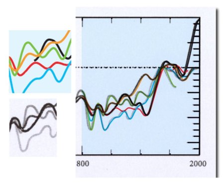
The excerpt is about global temperature history - what else - and shows a spaghetti graph. Here it is:
;)
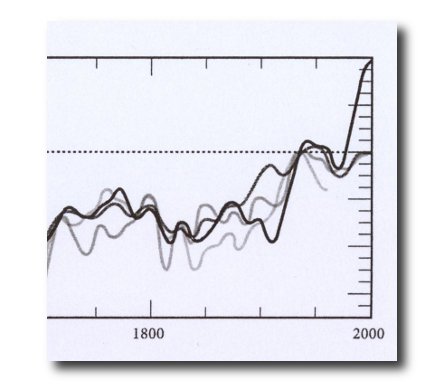
Notice anything odd? Of course you do: the Briffa series has been truncated at 1960 (this looks similar to the end-padded version of the Trick that was used by the IPCC in the Fourth Assessment Report). Here's a blow-up just to make it all clear...
 But there's something else odd about the series shown. Take a look at the one with the very sharp uptick at the right hand end. That's normally the instrumental temperature, isn't it? But now follow it back towards the left. It seems to keep right on going back past the beginning of the instrumental record to...well, let's take a look. If you click on the first chart above it will give you a full-size blowup. If you examine this, you will see that the series goes right back to AD 1000.
The source of this data is given as PD Jones, TJ Osborn and KR Briffa, The evolution of climate over the last millennium, Science 2001; 292(5517): 662-7. Let's take a look at that source shall we? Here it is:
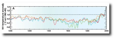
The caption reads:
Fig 2A: Northern Hemisphere surface temperature anomalies (°C) relative to the 1961-1990 mean (dotted line). Annual mean land and marine temperatures from instrumental observations (black 1856-1999)...and estimated by Mann et al (red 1000-1980)...and Crowley and Lowery (orange, 1000-1987). April to September mean temperature from land north of 20°N estimated by Briffa et al (green 1402-1960) and estimated by recalibrating (blue, 1000-1991) the Jones et al Northern Hemisphere summer temperature estimate. All series have been smoothed with a 30-year Gaussian weighted filter.
As we can see, the Briffa series was truncated in the original, so King and Walker appear blameless for hiding the decline - that was down to the CRU team. But what about the instrumental record? Regrettably, there is a crucial difference between Jones' paper and the King and Walker book. Here's the twentieth century sections of both graphs side by side, so you can see what was done:
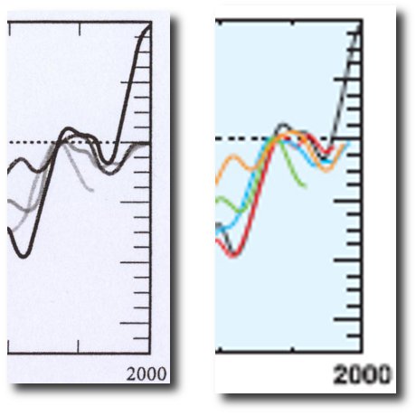
As far as I can tell, in the King and Walker book the Hockey Stick - the red series from the Science paper - appears to have become conjoined with the instrumental record with a smoothing to hide the join.
Golly.
 Bishop Hill