Ryan O'Donnell has posted a splendid pictorial guide to the oddities of Eric Steig's method for creating trends in the Antarctic. If you have been one of the people not following the story too well so far, here's a little layman's version of the posting, which assumes no prior knowledge. I hope this helps.
There's a lot of talk of the Antarctic peninsula. This is fairly obvious at the left hand side of each map below. The name refers only to the narrow bit of land though. The slightly fatter bit that joins the Peninsula to the main part of the Antarctic continent is West Antarctica.
Now Steig's method purported to show that he whole continent was warming, and particularly West Antarctica. Previously it had been thought that only the peninsula was warming.
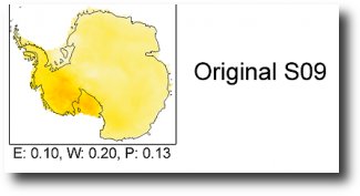
Here's Steig's original result with the warming showing up as the dark colour in West Antarctica.
 O'Donnell has now shown what happens when you artificially add warming or cooling trends to some of the weather stations included in the dataset. Firstly see what happens when you add some warming to stations in the Peninsula. As you go from left to right in the map below, more and more warming is being added, but only to the peninsula stations. However, mangled by Steig's algorithm, this extra warmth turns up as warming, not in the Peninsula, but in West Antarctica.

Now what happens when you cool those same Peninsula stations down? As you can see, the effect is to cool down the south Pole and, erm, to make West Antarctica warmer...

Now see what happens when you add warmth to stations that are actually in West Antarctica. Not much actually...

And what about cooling them down? No, that has no effect either.
 So what the Steig method does is to take any warmth in the Peninsula and spread it out over West Antarctica. In other words, Steig's result is an artefact of his methodology and not something that is inherent in his data.
Game, set and match.